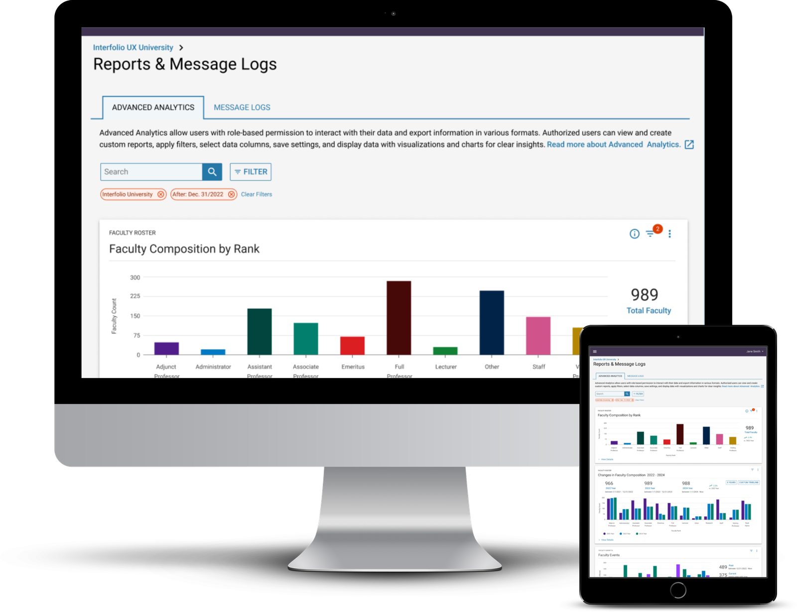
Advanced Analytics - Dashboard
OVERVIEW
We believe incorporating report functionality will provide our clients with a comprehensive dataset on faculty. This information will help users make data-driven decisions about faculty and provide transparency into the institution's faculty lifecycle.
ROLE
UX Designer: User Research, Wireframing & Testing
December 2023 - Ongoing
Our Approach
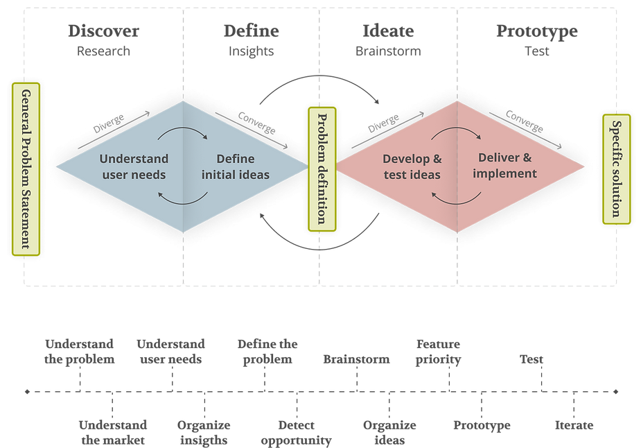
Our process is based on the Double Diamond Theory and Lean UX process. We aim to incorporate the key phases of Discovery, Definition, Ideation, and Implementation in all of our projects.
The Problem
[Product Name] doesn't allow administrators to effectively track and understand an institution's faculty composition and lifecycle events, making it challenging to make informed and strategic decisions regarding resource allocation and hiring. The current product capability does not offer a reporting feature.
Research Method
Client Interviews helped us understand our users' thoughts, actions, and interactions with our product. We learned what scope of reporting would be most beneficial to our clients and, from an internal perspective, also the most cost-effective approach.
Survey with Design Validation helped us understand the value of each proposed widget on the dashboard and confirm widgets provide actionable insight.
Diary Study helped us to track and understand user interactions, behaviors, and experiences with [Product] advanced analytics over a set period. We validated that the data we are analyzing and the functions and features of our analytics meet the needs and expectations of our users during their daily tasks. We recorded our users' experiences while they used advanced analytics in everyday practice to understand better:
- how users interact with analytics;
- the difficulties our users face with data analysis;
- the features users find most helpful.
This knowledge helped us make data-driven design choices to enhance usability, advanced analytics, and overall user satisfaction.
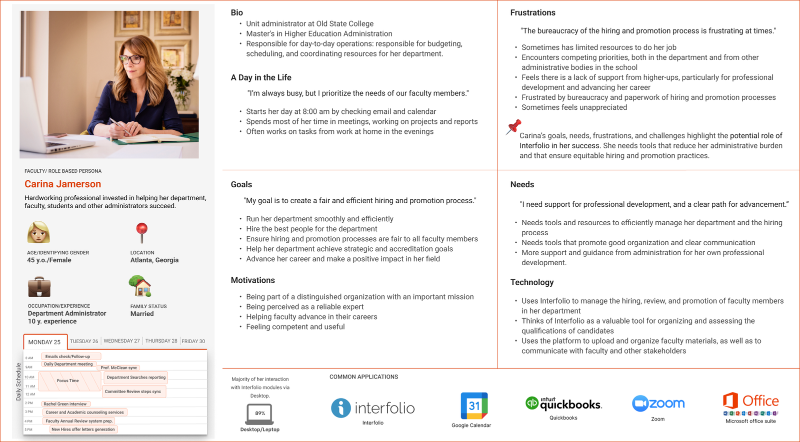
Persona
Interview Reserch Overview
9
institutions
- 3 were prospective clients
- 5 were in the early stage of implementation
- 1 is an experienced [Product Module] user
- All client institutions have been using one or more [Product] modules for at least 3 years.
- All participants worked within the office of the provost or managing faculty information systems for their institution.
Key Takeaways
- Clients struggle with managing and analyzing faculty data
- Clients want graphs to help inform them about the specific actions that need to be taken
- Clients need a robust tool to manage and analyze faculty data in order to provide support to faculty members and ensure the smooth and effective operation of their institution.
- Faculty data is important for decision-making on hiring, promotions, and diversity
- Spreadsheets are not effective for visualizing and tracking this data
- Stakeholders frequently request and report on faculty data
Client Needs
- The ability to run or access various reports should be determined by the role and level of access.
- Access to the information within reports needs to be customized to ensure specific users/roles have access to sensitive/confidential information.
- All participants agreed on the importance of a visual representation of faculty data.
Questions our clients want to answer
Faculty Growth and Promotion
- How has the faculty grown over time?
- Which faculty members are going up for promotion, and when?
Roles and Departments
- How can different roles and their specifics be tracked?
In addition to their primary department, what other departments are faculty members working in? - How can faculty tracking spread across multiple departments be improved?
Faculty Departures and Retention
- How many faculty members have been lost, and what types of departures are they (not retiring, successful/unsuccessful retention offers)?
- How has COVID-19 affected faculty, including family leave and the timeline of events?
Possible with current Product capabilities
Demographic Composition
- What is the demographic composition of the faculty?
- How do certain appointments differ across gender, race, and ethnicity?
- Is there a disparity between women and men in the length of time spent as associate professors?
- Which faculty members are close to retirement age?
Salary and Compensation
- What is the salary difference between different faculty members?
Faculty Agreements and Negotiations
- What questions do faculty have regarding the new part-time faculty agreement negotiations?
- What arrangements are made for different roles?
Roles and Departments
- How much time is the faculty member spending on dedicated activities, and how does this compare to their assigned workload?
Requires Data Integrations
UX Recommendations for Answering Client Questions
- Use visualizations and charts to present the data in a visual and easily understandable manner to extract insights and identify specific actions that should be taken based on the information displayed.
- Enable users to interact with the data and drill down into specific details or subsets of the data.
- Integrate data from different sources, such as the faculty database, [Ptroduct modules], HR system, etc., to provide a comprehensive view of faculty-related information.
Data our clients want to track/compare(e.g., from one academic year to the next)
Faculty Growth and Promotion
- Keep track of faculty progression by calculating time in rank and noting tenure and promotion dates
- Monitor faculty events such as promotions, retirements, and status changes
- Track contract expiration dates and changes in faculty roles and responsibilities
Faculty Departures and Retention
- Track faculty turnover
- Monitor workload and status of adjunct faculty members
- Accurately calculate and manage various types of leaves
Possible with current Product Capabilities
Demographic Composition
- Utilize data on gender and race/ethnicity to analyze representation and equity in various contexts
- Monitor and assess the diversity of faculty pools, specifically examining gender, race, and ethnicity
- Track progress over time and identify areas that require improvement
- Analyze faculty demographics in promotion and tenure processes to identify any disparities or barriers based on gender, race, or ethnicity.
Salary and Compensation
- Comparing salary data across academic years to identify patterns or disparities.
- Comparing salary data based on gender, department, school, etc.
Roles and Departments
- Maintain a database of emeritus faculty members and track vacant, open, and leadership positions.
Requires Data Integrations or Additional Enhancements
UX Recommendations for Data Tracking
- Provide users with the ability to run reports based on their specific requirements.
- Allow users to save and reuse report configurations as templates for future use.
- Allow users to export or download the generated reports in different formats, such as CSV or PDF, to facilitate further analysis or sharing with others.
- Ensure that the reporting functionality pulls data directly from the most up-to-date source. Implement automated data updates to minimize manual effort and keep the reports accurate and current.
- Allow users to schedule reports to be automatically generated and delivered to their inbox or shared with other stakeholders.
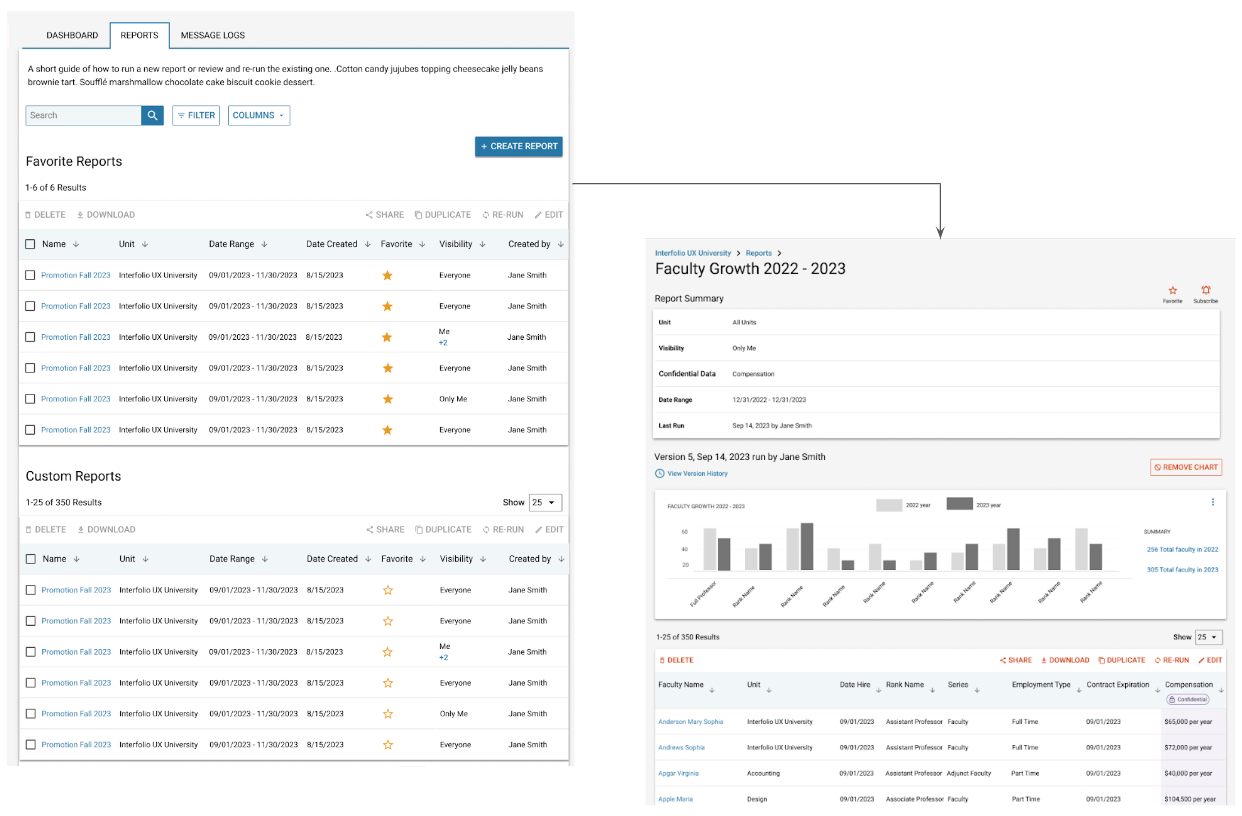
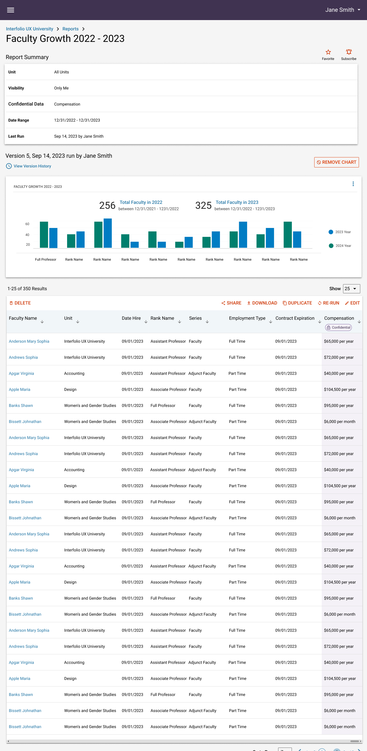
Wireframes
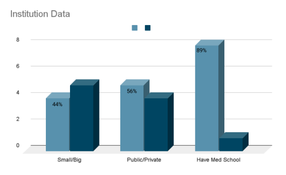
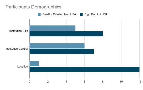
Survey & Design Validation Overview
13
institutions
- 8 PAC members contributed their input through the focus group method
- 5 individuals completed the survey
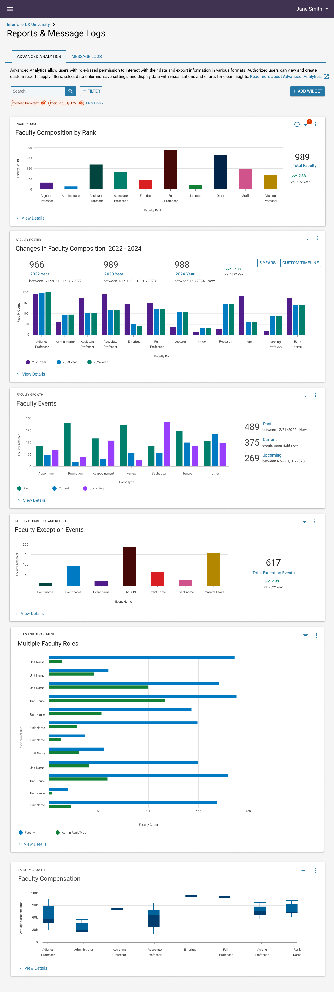
- Out of the six widgets that were evaluated, five of them received 100% positive feedback
and are considered valuable. - "Multiple Faculty Roles" widget only received a rating of 60%
Six widgets were evaluated. Five received 100% positive feedback and were deemed valuable. However, the "Multiple Faculty Roles" widget received only a 60% rating.
Reserch Findings
Participants want data they can use to create reports for senior colleagues and make informed resource allocation decisions for colleges/units and departments. They also seek to identify inconsistencies or variations in the data to help them make data-driven decisions that align with their specific needs.
Research participants said they do not use the compensation field due to concerns over privacy, which may hinder the adoption of the "Faculty Compensation" widget. However, the ability to compare faculty compensation throughout the institution might encourage them to use this field. To serve the needs of our [Product name] clients, we must understand better the privacy policies related to faculty compensation and the existing capabilities of Lifecycle Management.
Participants requested that [Product name] be integrated with other systems to enhance analytics with additional data and address data entry and management issues.
Validated Items
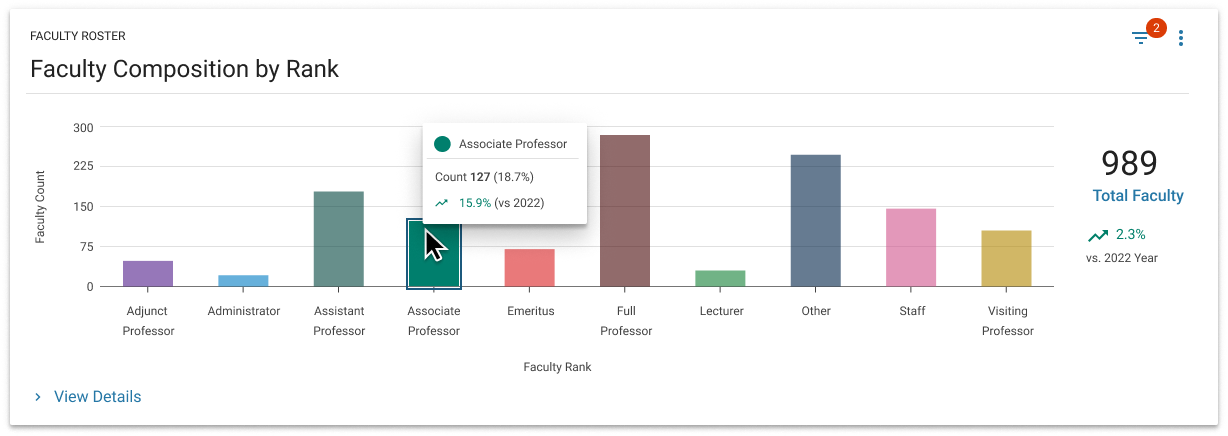
? Faculty Roster | Faculty Composition by Rank
- What is the composition of my faculty roster at a point in time?
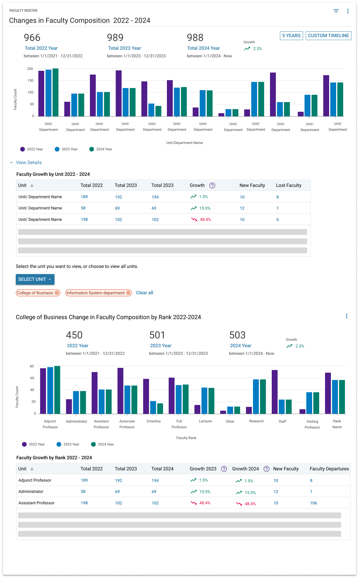
? Faculty Roster | Faculty Growth by Rank [Time Period]
- How has the distribution of faculty changed over time?
? Faculty Growth | Faculty Events
- Which faculty members are going up for promotion, and when?
? Compensation | Faculty Compensation
- What is the salary difference between particular faculty members?
? Faculty Departures and Retention | Faculty Exception Event
- How has COVID-19 affected faculty, including family leave and the timeline of events?
? Roles and Departments | Multiple Faculty Roles
- How many faculty members serve in multiple roles on campus?
UX Recommendations
Enhance data management capabilities: To address concerns about data overload, enhance the widget with advanced data management features. This could include the ability to organize data based on different academic appointee types like assistant professors, associate professors, etc. This will streamline user navigation and facilitate institution-specific data analysis.
Generate comprehensive table: The widget must generate comprehensive tables from the displayed data, enhancing readability and allowing for easy reuse of data in various reports. This capability aligns with our goal of ensuring universal accessibility to our services.
Revise widget details design concept: Enhance usability for institutional admin users, enabling them to easily access information about faculty composition based on their unit vs. rank.
Customizable Time Views: Allow the option to select different time views such as 3-year or 5-year periods, or to set a custom timeframe. This will help users analyze data over extended periods, and provide more insight into trends and patterns.
Additional data visualizations: Introduce a new visualization displaying an upcoming timeline of events, illustrating the amount of work within the next 2 weeks, month, 3 months, etc. This visualization will provide a visual interpretation of the workload without the need for further filtering, making it easier for users to understand their upcoming tasks and plan accordingly.
Implement distinct data visualizations for various academic evaluations, including sabbaticals, tenure, reviews, and reappointments. This approach allows users to evaluate tenure progress institution-wide and helps them plan committee workloads more efficiently.
Include a box and whiskers plot: Participants found the box and whiskers plot to be effective in identifying outliers, especially among different faculty ranks. Including this visualization option will help users better understand salary distribution within each job title.
Visualizing Distinct Roles: To provide a more comprehensive view of faculty roles, visualize compensated, distinct roles, such as administrative appointments, on the widget. Display these roles prominently on the widget and provide additional information or context about their nature.
Provide a text summary of the visualization, describing trends or patterns for users who might find the visual representation confusing or inaccessible. This written description can benefit non-visual users or serve as a backup for users unable to access the full visualization, ensuring everyone can understand the data regardless of potential obstacles.
Additional Findings: Continue researching to pinpoint gaps in data visualization (V2 data integration) and identify areas lacking report generation capabilities. One fundamental improvement would be the ability to create customizable reports. Empowering users to generate custom reports based on displayed data would allow them to extract precise insights to share with stakeholders like college or unit heads and department chairs. This enhancement would provide users with more flexibility in communicating data and translating it into actionable information for decision-making.
Future Recommendations
Identify Reasons for Faculty Departure: Provide an option to identify reasons for faculty departures when the "lost faculty" category is selected to understand the reasons behind faculty attrition and devise retention strategies.
Analyze Diversity and Inclusion Initiatives: Utilize demographic data to evaluate the success of diversity, equity, and inclusion initiatives.
Focus on Hiring Resources: Highlight regions where hiring resources need to be allocated to help institutions prioritize their recruitment efforts and effectively utilize resources to address staffing needs.
Incorporate demographic factors: Incorporate demographic factors in data analysis. Include gender and race to assess potential inequalities in merit increases and retention efforts. Use demographic factors to ensure fairness and identify disparities.
Track preemptive retentions: Create an event-tracking system to monitor preemptive retentions. Track events that may not directly affect faculty lifecycle but contribute to long-term retention. This will allow for a better understanding of the factors that contribute to faculty retention and provide insights into the effectiveness of retention efforts.
Visualizing Distinct Roles: Visualize distinct roles, such as administrative appointments, prominently on the widget.
Clearly distinguish multiple appointments and actual multiple roles: Clearly differentiate between multiple appointments and actual
multiple roles using visual cues. Display the home department of faculty members, as many only teach in one department.
Include endowed chairs and available vacancies: Include information about endowed chairs and available vacancies
to offer a more complete picture of faculty positions.
Add benchmark data from comparable institutions: This will enrich users' understanding of faculty member compensation by allowing comparisons with top-ranking public and private institutions.
Include CIP codes and data from IPED survey: Including CIP codes can help adjust and ensure equitable faculty salaries based on discipline. Adding survey information from IPED would further support the aim of equitable wage measurement.
Diary Study Overview
Alpha Group Overviw
Our Process
10
institutions
- Advanced [Product Name] users who are
- Submitted feature request or/and
- Previously participated in Advanced Analytics reserch
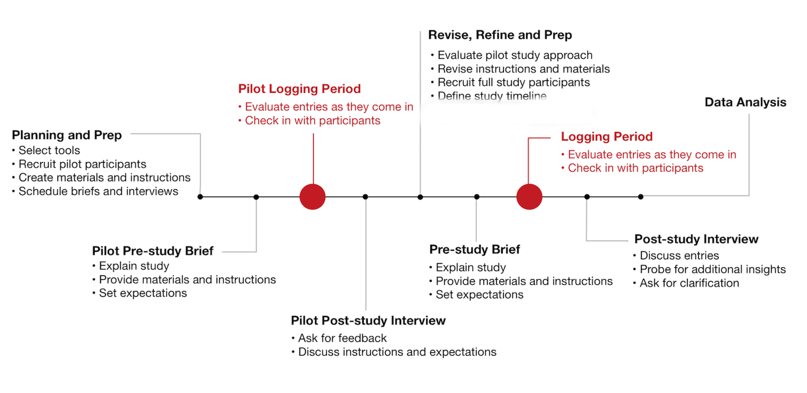
We used a third-party tool to create the Alpha Dashboard and conducted our research study in two phases: Faculty Composition and Faculty Events. Participants in the alpha group were given access to their institution's data to assess if the dashboard meets their internal reporting needs. We suggest allocating about two weeks for each phase, totaling four weeks. To assist participants, we provided a questionnaire for use throughout the research, encouraging weekly completion as needed. We also held weekly office hours to address any participant queries. Following the 4-week study, we engaged in one-on-one conversations with participants to ensure we gathered sufficient feedback.
Next Steps
- Diary reserch analysis.
Selected Works
Advanced AnalyticsData Vizualisation
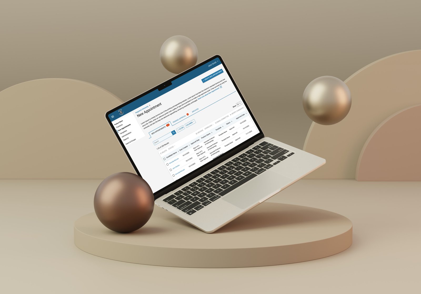
New AppointmentSAAS UX Design
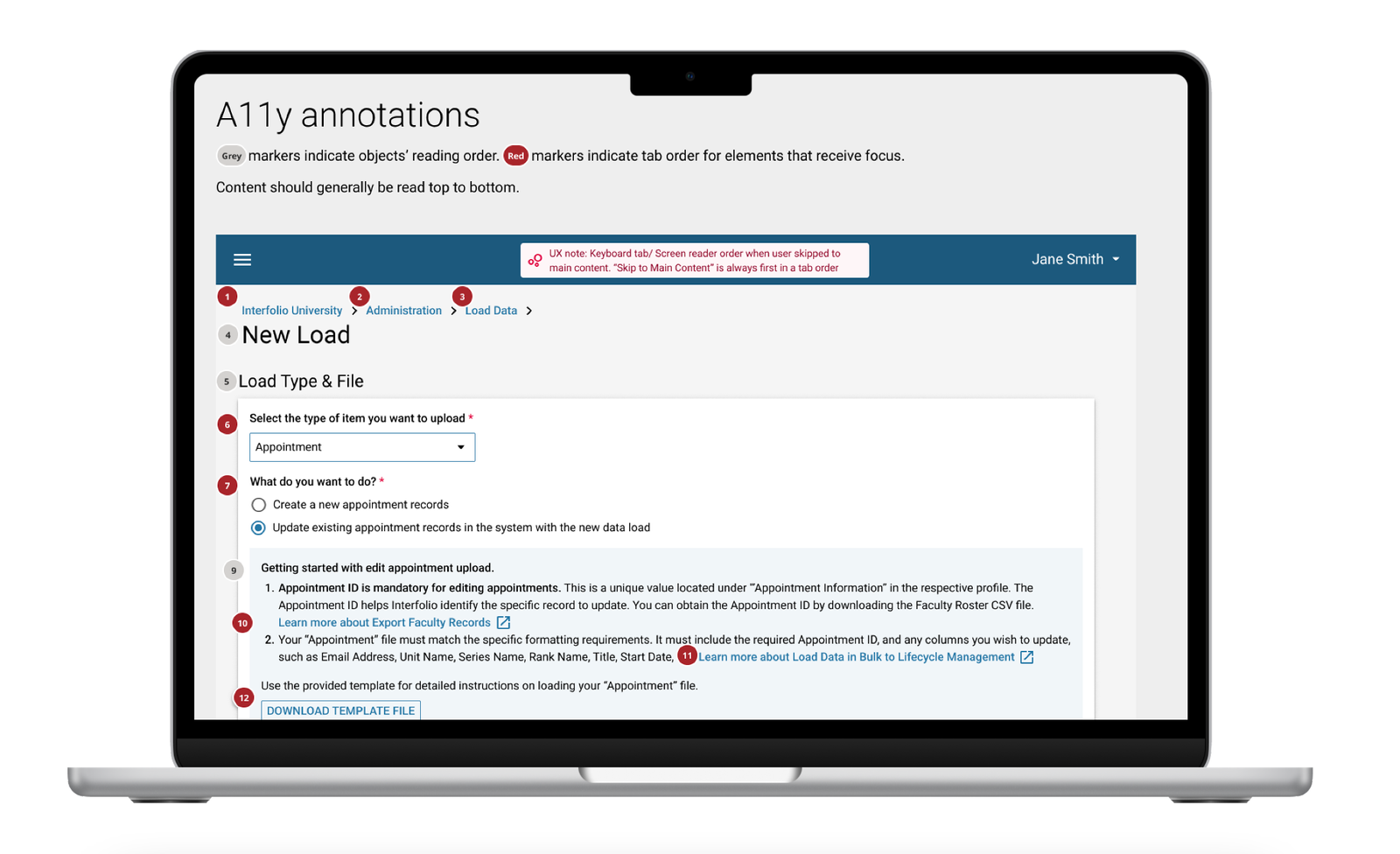
Edit Appointment Information via Data LoaderSAAS UX Design