
Author: Olha Yastreb
Data Visualization Guide
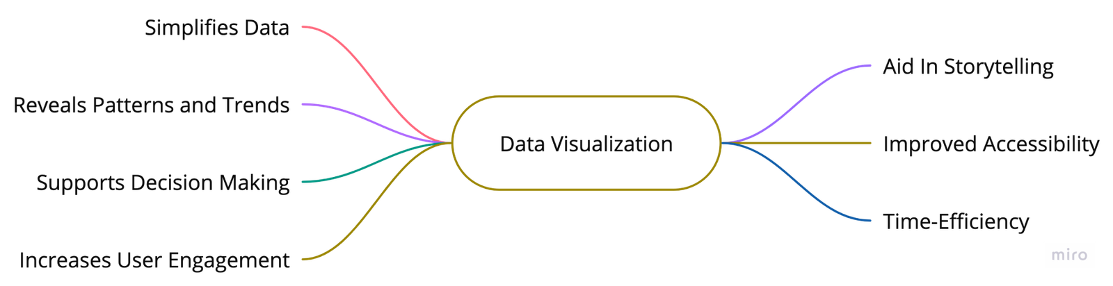
Why does data visualization matter?
Principles at the Core
 Explore vs Explain
Data has different uses - it can be presented, found, explained, or explored. It is crucial to understand what users expect from these uses. Exploring - users need helpful tutorials, best practices, or guidance. Explanation - the visualization should present a concise and clear story with comprehensive insights.
 Accessible for All
Data visualization must be accessible and easily understandable to everyone. To make designs inclusive, select color-blind-friendly palettes, add texture, and test with disabled users. Always provide labels or easily understood icons along with the chosen color for a specific metric.
 Ethical Design
Designs must always prioritize ethical and honest information presentation. This entails displaying data in a clear and objective manner without distortion or manipulation.
? Form Follows Function
Use clear, simple charts with high contrast, enabling charts to speak for themselves without distractions. Consider the user's needs and provide options for layering charts, exploring data, and delving into details. While aesthetics are important, the main focus should be on functionality.
Always consider your audience. Your data should cater to their background, needs, and goals, and visualization should effectively communicate your data's story to them.
User Understanding
Learn about the user’s background, their level of familiarity with the data, and their goals for using the system to tailor the visual representation as per their context.
Intuitive Design
Develop simple, easy-to-understand visualizations while avoiding any potential confusion or complexity.
Interactivity
Encourage user interaction and exploration; provide tools that allow users to manipulate data and view it from different perspectives.
Effectiveness
Ensure that the visualization provides informative and meaningful insights that allow the user to make the decisions they need.
User Feedback
Continually iterate and improve the visualization based on user feedback for ultimate usability.
Designing Chart
UX Best Practices for Designing Charts
- Use a clear and descriptive title.
- Use different colors to represent various data categories. To ensure accessibility, use Accessible Palettes.
- Use percentages or actual values to indicate the size of each data category.
- Order the data categories in descending or ascending order to emphasize the most significant or smallest portions.
- Use a consistent axis scale.
- Label each data category clearly to enhance readability.
- Include a legend if there are more than a few data categories.
- Always include a source or reference data in a nonvisual way.
- Include tooltips or pop-ups that display specific data values when hovering or interacting with the chart.
- Use additional visual cues such as line patterns or markers to ensure accessibility for colorblind users.
- Highlight important data points or trends.
- Use animation or interactive features to enhance user understanding and engagement with the chart.
- Use responsive design.
- Test the chart with a diverse group of users to ensure its usability and understandability.
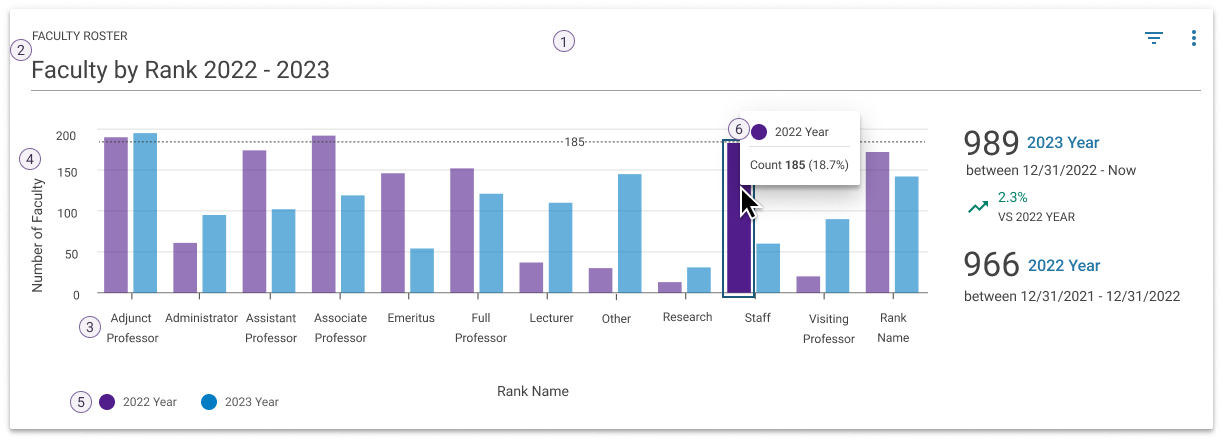
Chart Anatomy
- Frame - the area where the data is visualized.
- Title - provides initial context and helps focus the user on the purpose or story of the chart.
- Axes - the vertical (y) and horizontal (x) directions that represent variables in the data.
- Axis label - names the x- or y-axes to tell the user what data is represented.
- Legend (or Key) - defines the relationship between color and acts as a point of interaction for isolating data groups.
- Tooltip - shown when areas within the frame are hovered or in focus.
Choosing the Right Visual Format
Pie and Donut Charts
Useful for visualizing data sets that involve categorical or qualitative information. Each slice corresponds to a specific category, and its size is proportional to the value or percentage that category represents.
Usage Guidelines
A pie and donut chart is used to show parts of a whole and represent numbers in percentages where the total sum of all segments needs to equal 100%.
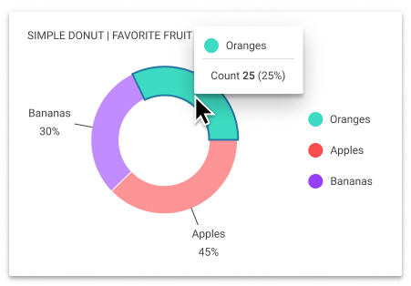
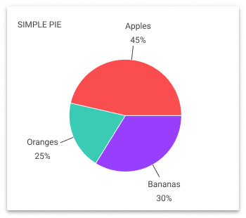
Use a pie or donut chart when:
- you have 6 categories or less
- showing a single set of data
- comparing proportions
? Do NOT Use Pie or Donut Charts:
- if you have more than 6 categories
- if a pie/donut chart is necessary, group the smaller categories into an ‘Other’ group and use the “Pie with drill-down” to allow access to the details within the group
- for values that are very similar
- Bar charts would be much better choice in that case
- with similar colors for different data categories, as it may cause confusion.
- if your data is sequential, use a histogram instead.
- if you have multiple data sets or want to compare different series of data, consider using other chart types such as bar or line charts.
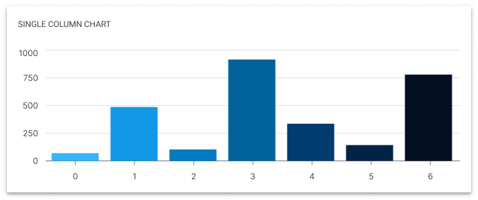
Bar and Column Charts
Widely recognized and utilized for comparing different categories or groups. They provide a clear visualization of quantitative data by representing each category with a separate bar, with the height or length corresponding to a specific value.
Usage Guidelines
Use a horizontal bar chart when you have long labels. Always start the y-axis at 0 to appropriately reflect the values in your graph. Limit the amount of detail on the axis.
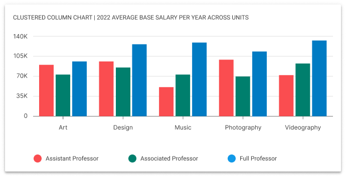
Use a bar or column chart to:
- compare different values,
- show differences over time,
- showing rankings or order,
- presenting categorical survey responses,
- comparing data with a fixed reference point.
? Do NOT Use Bar or Column Chart:
- Incorporate 3D effects or shading in the chart; it can distort data proportions, hindering accurate comparisons.
- Apply rounded corners in charts; they can blur the precise value of chart data.
- Overuse decimal places in percentages or values unless needed for accuracy.
- Opt for similar color schemes for different data categories; this can lead to confusion.
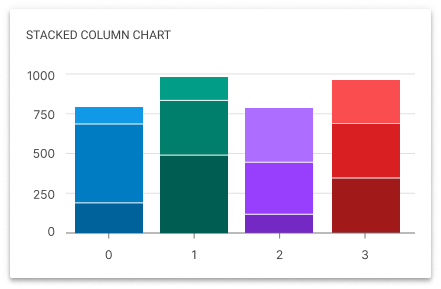
- Resort to stacked bar charts for quick categorical data comparisons. They should be considered as an "Explore" experience due to the challenge in determining a middle value for three or more categories.
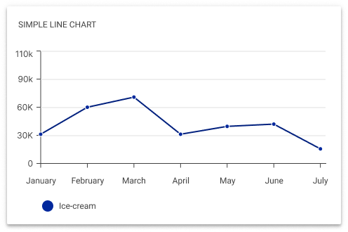
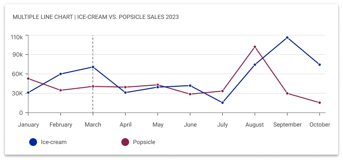
Line Charts
Show trends in data over a period of time or a particular correlation. For example, one axis of the graph might represent a variable value, while the other axis often displays a timeline.
Usage Guidelines
Line charts are well-suited for indicating changes or trends across continuous categories such as age ranges, income brackets, or educational levels.
Use a line chart to:
- you have 7 lines or less
- showing continuous data trends
- comparing multiple data sets
- analyzing relationships between variables
- visualizing progress towards goals
- representing continuous data categories
? Do NOT Use Line Chart:
- if not comparing values over time, as it might create confusion.
- with excessive grid lines or unnecessary decorations that may distract users from the main data.
- if you need to compare more than 7 lines.
- consider alternative visualization methods as line charts may become overcrowded.
- when using dual-axis line charts, as they can result in misleading correlations, data manipulation, and a complex user interface.
Area Charts
Similar to line charts, with a few subtle differences. They can both show change over time, overall trends, and continuity across a dataset. But, while area charts may function the same way as line charts, the space between the line and axis is filled in, indicating volume.
Usage Guidelines
When using overlapping area charts, make colors transparent so information isn’t obscured in the background. Avoid using area charts when there are more than 4 categories. In that case, use line charts.
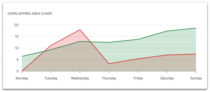
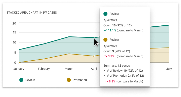
Use an area chart to:
- track changes over time,
- show cumulative data,
- compare multiple categories,
- highlight patterns or anomalies,
- demonstrate proportions,
- visualize distribution.
? Do NOT Use Area Chart
- if there are more than 4 categories
- when comparing specific values or making precise
- comparisons between data points.
- when the data has sharp fluctuations or irregular patterns, as it may distort the interpretation of the data.
Scatter Charts
Shows the relationship between two variables, allowing viewers to immediately understand a relationship or trend. They are most useful when you have numerical data.
Usage Guidelines
Use scatter charts when you need to visualize the relationship between two numerical variables. It is particularly useful when you have a large dataset with many data points. When using scatter charts, start the Y-axis at zero and keep the scale evenly distributed across both axes.
Unlike other charts, scatter plots can handle large amounts of data without becoming cluttered.
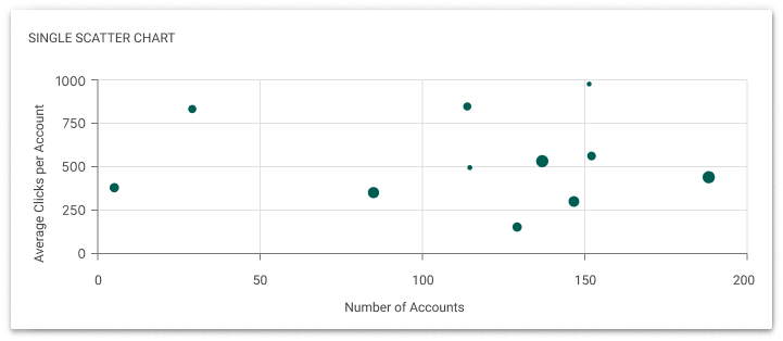
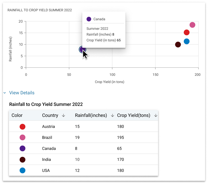
Use a scatter chart to:
- understand correlation,
- compare data points to identify anomalies,
- see how one variable affects another,
- see a correlation, pattern, trend, or relationship,
- visualize distribution or clusters,
- identify potential outliers,
- analyze the strength of the relationship.
? Do NOT Use Scatter Chart:
- Have more than two trend lines, as this can be confusing.
- Overcrowd the scatter chart with too many data points. If there are too many points, consider using techniques like data aggregation or interactive filtering to help users focus on specific subsets of data.
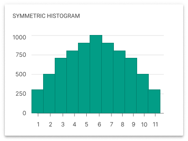
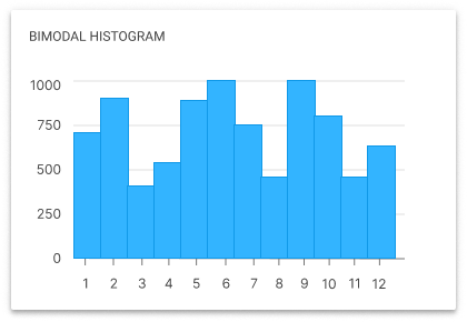
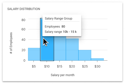
Histogram Charts
A visual representation that organizes data into ranges or intervals and displays the frequency or count of data points within each range.
Usage Guidelines
Use scatter charts when you need to visualize the relationship between two numerical variables. It is particularly useful when you have a large dataset with many data points. When using scatter charts, start the Y-axis at zero and keep the scale evenly distributed across both axes.
Unlike other charts, scatter plots can handle large amounts of data without becoming cluttered.
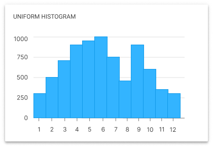
Use a histogram to:
- analyze data distributions,
- compare data sets,
- highlight outliers,
- understand data demographics,
- predict future trends,
- evaluate performance.
? Do NOT Use Histogram Chart:
- when the data is not numeric or continuous.
- if there is insufficient data or if the data points are not representative of the overall population.
*Legend
The histogram does not typically require a legend as the data distribution is represented directly by the bars, with the axes clarifying the data points. However, if different colors or bar patterns were used within the histogram to represent different data groups (like departments, gender, age groups, etc.), a legend would be necessary to decode these designations. Otherwise, a legend is not usually necessary for a single dataset.
Conclusion
A data visualization guide ensures consistent and accurate data presentation, enabling better decision-making and facilitating quick data interpretation for users. It also enhances user experience and fosters strong interactions by bridging the gap between complex data analysis and user understanding.
Let's connect!
Get in touch for opportunities or collaboration!
©2024 Yastreb Design. All rights reserved. Privacy Policy.?